Why Ilograph Added Contexts
In this article, we’ll look at the importance of contexts in system architecture diagrams and recent enhancements to how they are handled in Ilograph.
Defining diagram “contexts”
System architecture diagrams visually document complex technical systems. Most come in the form of either relational or sequence diagrams, with boxes representing system resources, and arrows representing relations (or steps) between them.
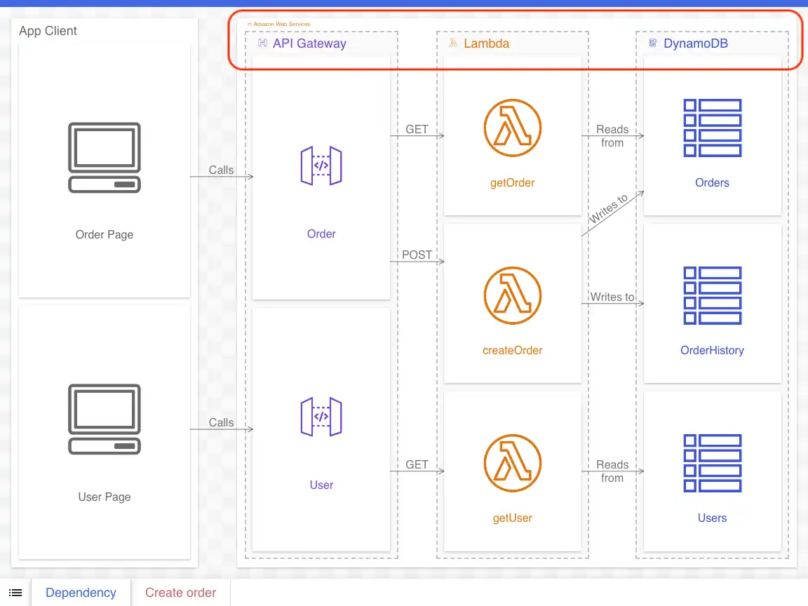
Like in the example below, the boxes (or nodes) with lines going between them are typically the main focus. We’ll refer to these as subject nodes. The background nodes (circled) are what we will refer to as context nodes. Context nodes implicitly give us information about where a subject node lives, its membership, or some other parent-child relationship:
Critically, the same basic diagram can be drawn with different contexts, or no context at all. In the following diagram, the foreground resources and the arrows between them are the same, while the context nodes change (or, in one case, are removed):
The benefits of contexts
All else being equal, more information is better when diagramming. Whether they represent concrete or abstract resources, context nodes provide important background information that gives broader understanding of a system. This information is especially useful to newcomers/new hires, especially because experts may inadvertently omit it during discussions.
Furthermore, if using an interactive diagramming tool like Ilograph, the level of detail can be lowered to shift focus to the context nodes themselves. This provides a higher-level view of the system and the relations between its parts:
Going the other way, contexts also provide bounded scopes to “zoom in” on:
The old method of using contexts in Ilograph
Default context and overrides
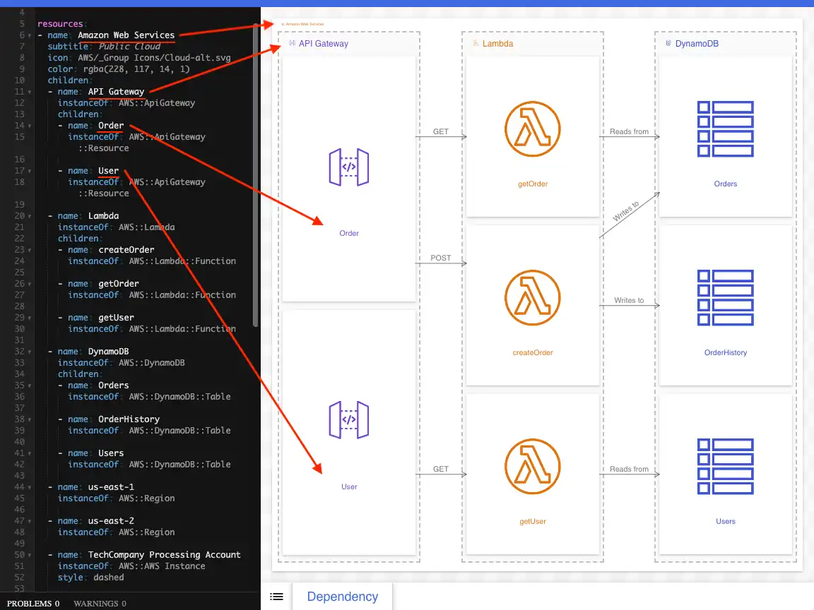
Since its inception, Ilograph has supported contexts. Resources in Ilograph are defined as a tree structure of parent and child nodes. This resource tree is a shared model used in different diagrams (called perspectives in Ilograph). By default, these perspectives are drawn with contexts derived from this tree:
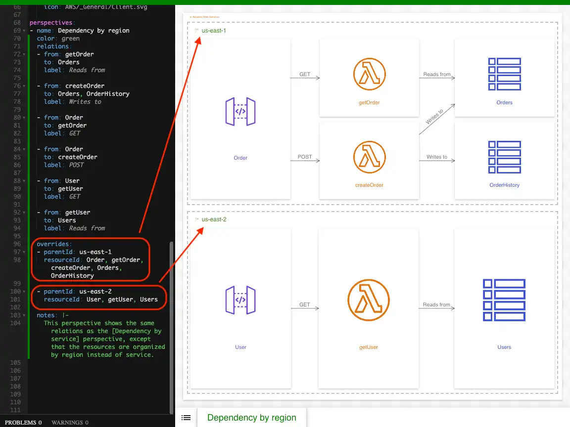
Diagram authors can change the context on a per-perspective basis using overrides. In a perspective, the parent overrides are declared individually (in the overrides section):
In the above two images, notice that the subject nodes and the arrows between them are identical; only the contexts nodes have changed.
Mixing in overrides with extends
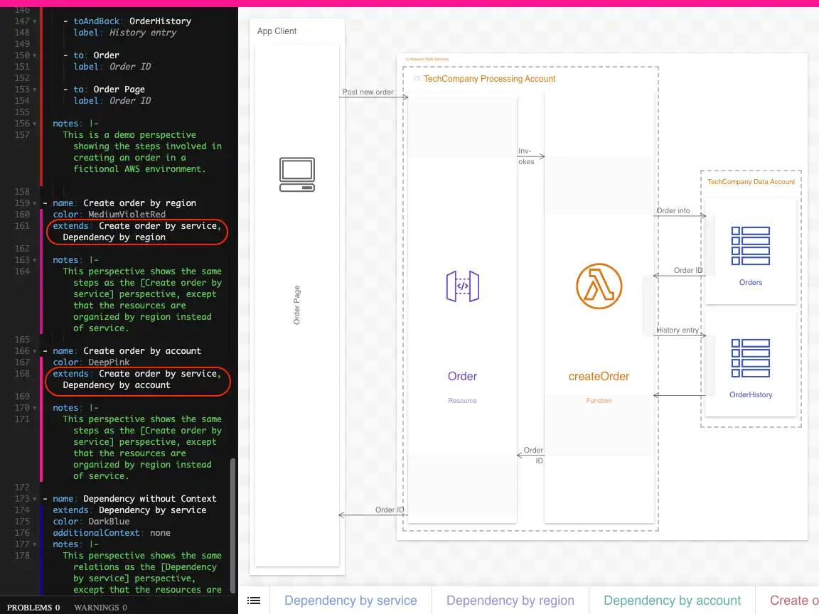
Context overrides apply only to the perspective they are defined in. To avoid repeating the same overrides in multiple perspectives, diagram authors can define overrides in hidden perspective(s) and then extend them in other perspectives:
Using this method, authors can mix-and-match many such “context” perspectives with “content” perspectives (which contained the actual relations/steps between nodes). Each combination results in a new perspective which appears in the tray at the bottom of the app, like in this example.
Drawbacks of the old method
While this technically works, there are many drawbacks to this method:
Parent overrides are not defined as a tree
While resources are defined as a parent-child tree, parent overrides are defined as a list of modifications. Not only is this syntax incongruous with how resources are defined, the overrides list is difficult to organize and understand.
Mixing perspectives isn’t intuitive
The primary purpose of perspectives in Ilograph is to show different relations (or sequences) between a common set of resources. The method of mixing “content” and “context” perspectives (described above) certainly works, but it isn’t intuitive and requires the use of the relatively advanced extends keyword. Furthermore, the diagram source code is cluttered up with many hidden perspectives.
It produces too many perspectives
Mixing every “content” perspective with every “context” perspective can result in a large number of perspectives appearing in the tray:
With too many combinations, users have to scroll to see them all. Furthermore, knowing which perspectives contain which combinations of content and context isn’t always clear.
Context is fixed during walkthroughs
Walkthroughs are defined on a per-perspective basis. Because perspectives can have only one context, this means walkthroughs can show nodes using only one context. Explaining different contexts using walkthroughs is therefore not possible.
The new contexts keyword in Ilograph
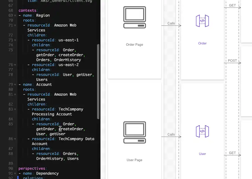
Because of the above drawbacks, Ilograph has a new top-level contexts keyword. This optional keyword allows diagram authors to define contexts that are shared across all perspectives. These contexts are defined as a tree of parent-child nodes:
Diagram viewers can then independently select each context and perspective:
The result is a more intuitive UI. There are far fewer perspectives in the perspective tray, and users can now expect each one to have unique relations or sequences.
The diagram source code is also clearer and less cluttered. Using the contexts keyword better signals the intent of the diagram author compared to defining contexts in hidden perspectives. And defining contexts as a tree is more in step with how resources themselves are defined.
Lastly, a perspective’s context can now be changed during walkthroughs. Along with explaining relations or sequences, walkthroughs can now also explain the different contexts nodes appear in.
Click here to view an example Ilograph diagram that uses contexts.
Is the old method going away?
No. Both perspective overrides and extending perspectives are here to stay, so the old method of mixing-and-matching perspectives will continue to work. Diagram authors are encouraged, however, to switch to the new contexts keyword to provide viewers (and themselves) with the best experience.
Questions or comments? Please reach out to me on LinkedIn or by email at billy@ilograph.com.


