IDL Part 1: Resources and Perspectives
Ilograph diagrams look like this:
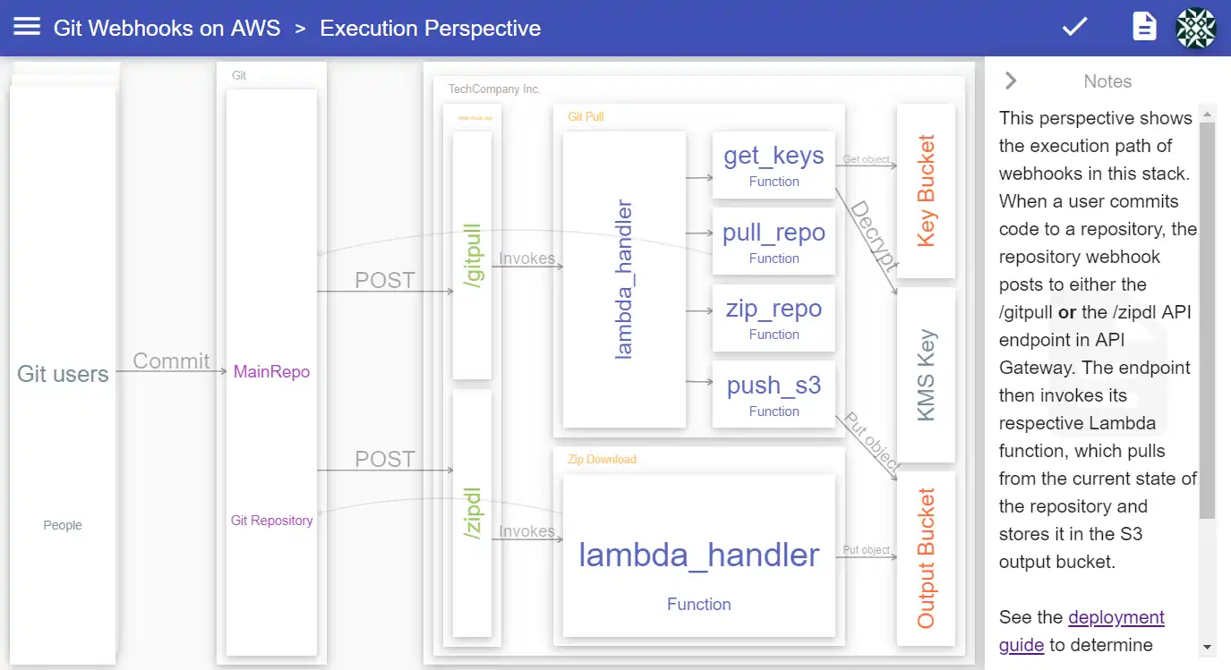
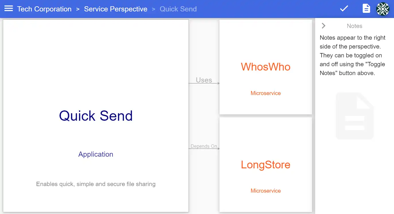
Unlike traditional diagrams, Ilograph diagrams are interactive. Users can click on resources to “focus” them, for instance. Doing this shows more details about that resource and hides resources that are not related to it:
Resources can also appear in multiple perspectives which the user can switch between:
Because Ilograph diagrams are interactive, Ilograph authors cannot simply place entities on a canvas. Instead, as an author, you declare your resources and the relationships between them. You do this using the simple but very powerful Ilograph diagramming language (IDL).
We’ll start with a very basic IDL example for a fictitious company, Tech Corporation:
resources:
- name: MiniChat
  subtitle: Application

- name: Quick Send
  subtitle: Application

- name: WhosWho
  subtitle: Microservice

- name: LongStore
  subtitle: Microservice

perspectives:
- name: Service
  relations:
  - from: MiniChat
    to: WhosWho

  - from: Quick Send
    to: WhosWho

  - from: Quick Send
    to: LongStore
When rendered in the Ilograph app, it looks like this:
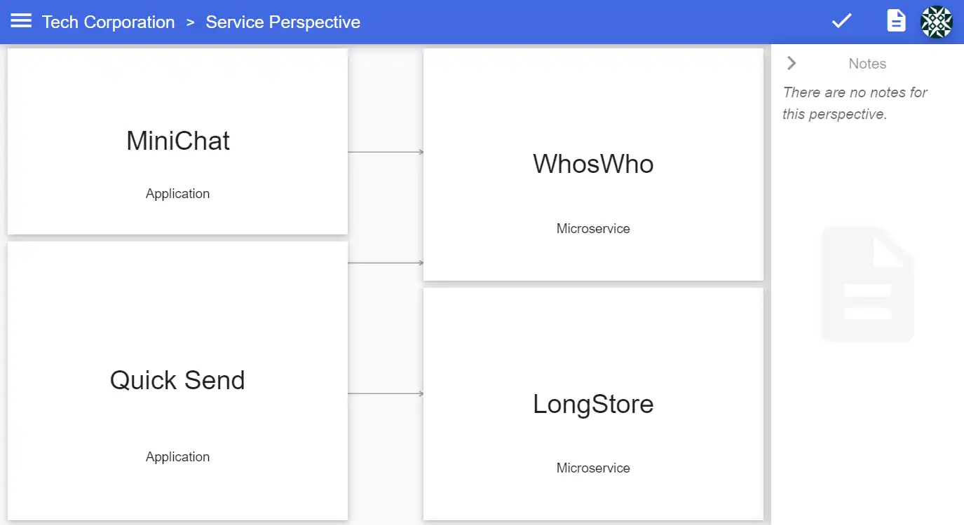
This Ilograph has four resources (“MiniChat”, “Quick Send”, “WhosWho” and “LongStore”) and a single perspective (“Service”). In that perspective, there are three relations, represented as arrows. Though there isn’t much detail yet, this perspective appears to show us which services are used by which applications.
We can make these relations explicit by adding labels to those arrows:
...
perspectives:
- name: Service
  defaultRelationLabel: Depends On
  relations:
...
All of the arrows in this perspective are now labeled:
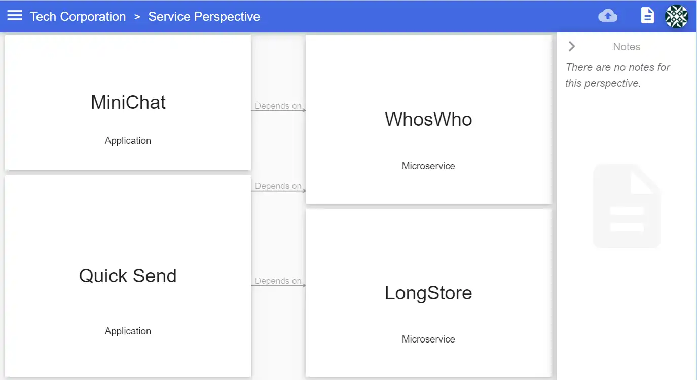
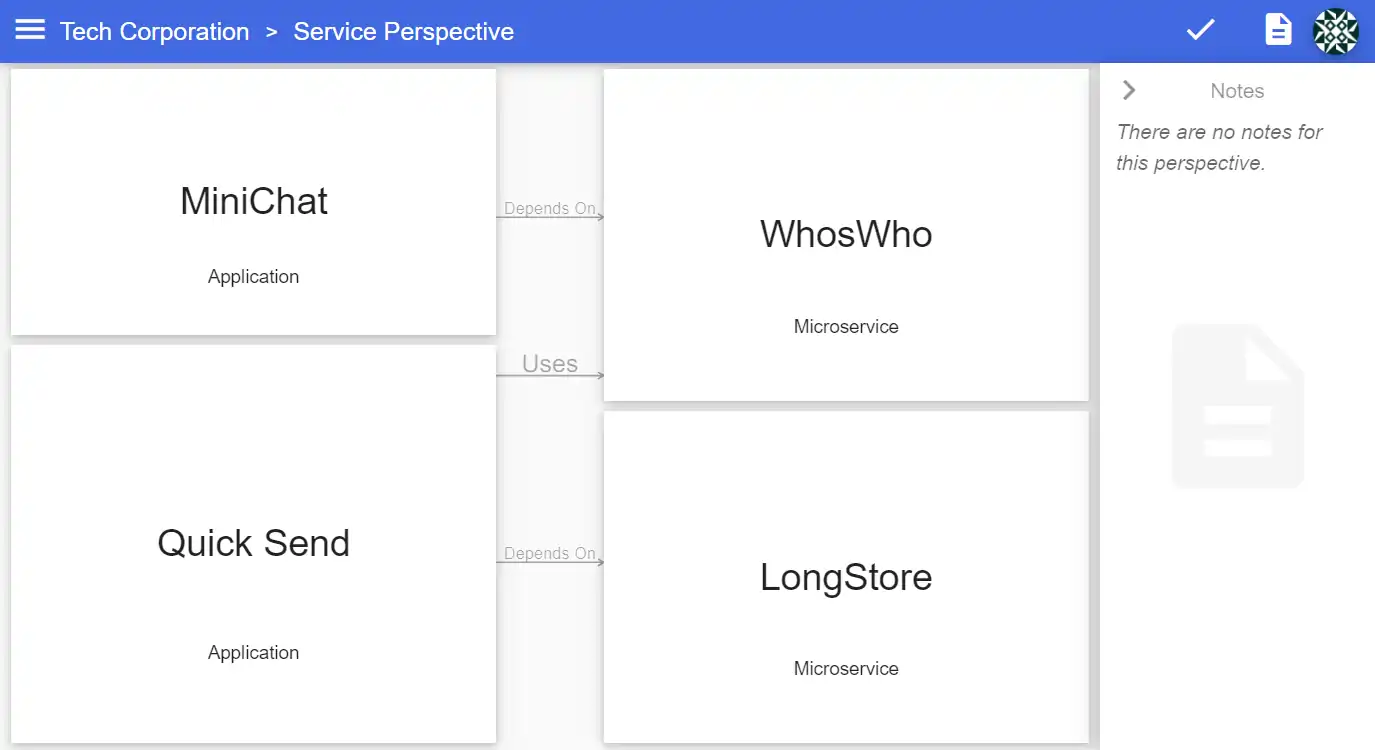
As the name defaultRelationLabel implies, this label is used only for relations that don’t have an explicit label. Use the label property set the arrow label on individual relations:
...
  - from: Quick Send
    to: WhosWho
    label: Uses
...
To add even more context for this perspective, use the notes property:
...
perspectives:
- name: Service
  defaultRelationLabel: Depends On
  notes: Notes appear to the right side of the perspective. They can be
  toggled on and off using the "Toggle Notes" button above.
...
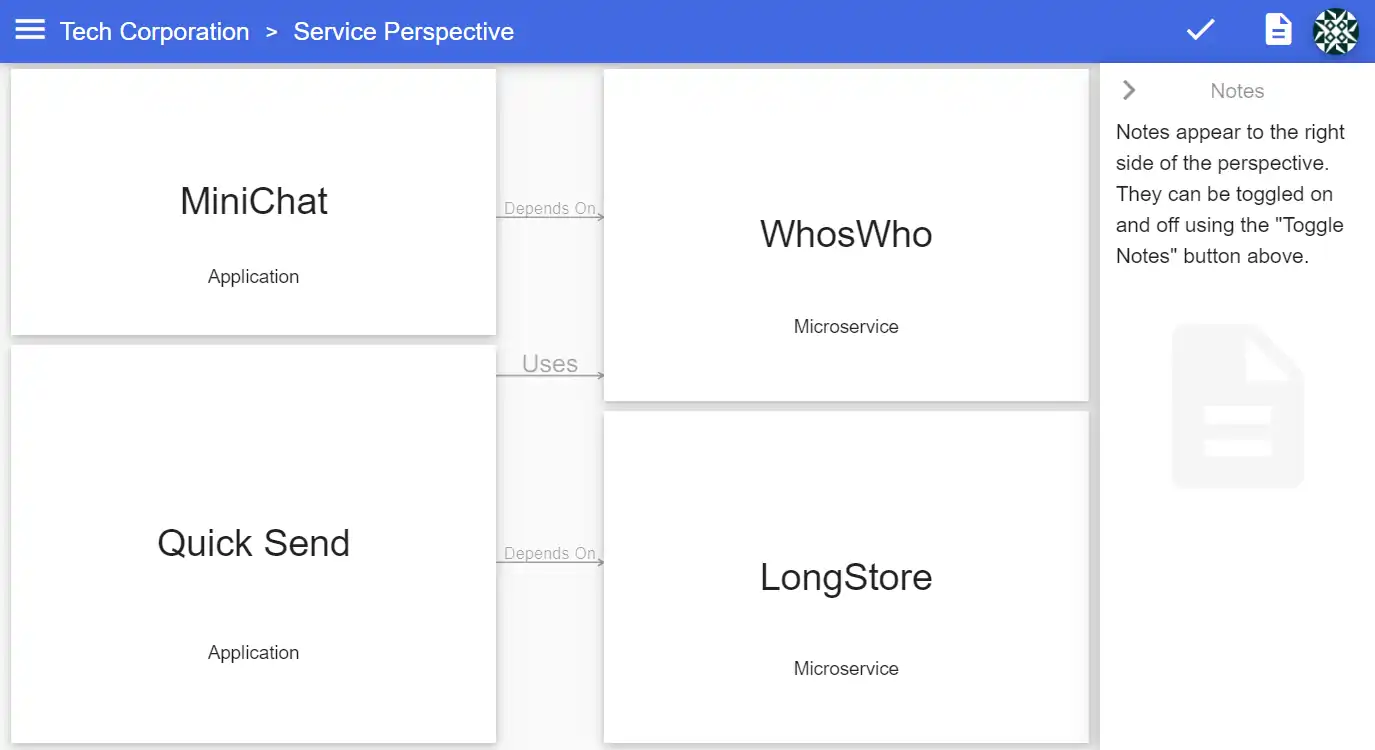
The color property lets us set the text color for resources. Giving different types of resources different colors improves the readability of your diagram:
resources:
- name: MiniChat
  subtitle: Application
  color: Navy

- name: Quick Send
  subtitle: Application
  color: Navy

- name: WhosWho
  subtitle: Microservice
  color: OrangeRed

- name: LongStore
  subtitle: Microservice
  color: OrangeRed
  ...

Colors can be specified using X11 color names or hex (e.g. “#FF00FF”).
Descriptions can be added to each resource. These appear when a resource is focused and are used to give more details about the resource:
...
- name: Quick Send
  subtitle: Application
  color: Navy
  description: Enables quick, simple and secure file sharing
...
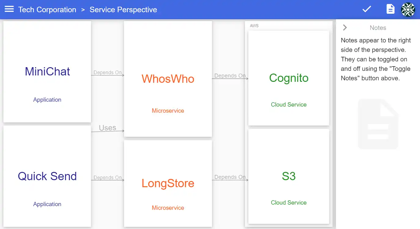
Lastly, we’ll augment this perspective with three new resources:
resources:
...
- name: AWS
  subtitle: Cloud service provider
  children:
    - name: Cognito
      subtitle: Cloud Service
      color: green

    - name: S3
      subtitle: Cloud Service
      color: green
...

perspectives:
- name: Service
...
  relations:
    ...
  - from: WhosWho
    to: Cognito

  - from: LongStore
    to: S3
Here, the “Cognito” and “S3” resources are children to the “AWS” resource. By default, this additional context will be visible in perspectives:
We’ll take a closer look and parent and children resources in a follow-up post. For now, you can check out this example in the Ilograph app. For more detailed, real-world examples, see the Drupal on AWS and Git Webhooks on AWS examples.


