

Breaking Up the Master Diagram

Below is a “master” architecture diagram of Ilograph’s back end deployed on Amazon Web Services (AWS). It is a relatively simple serverless back end that handles CRUD operations for the Ilograph web app but also serves Ilograph Desktop and the Export API. Here it is:
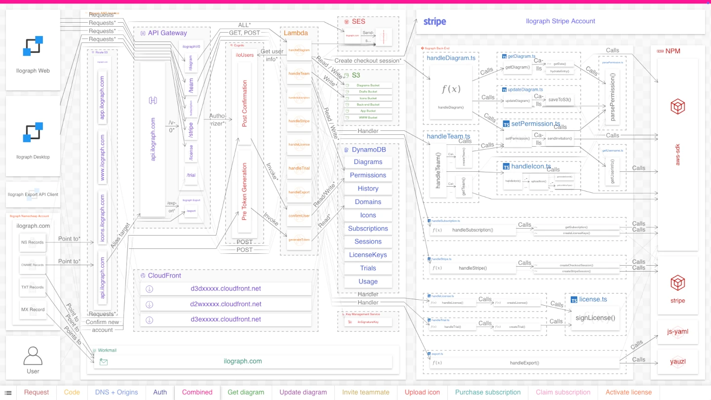
Simple, right? Well, no. Not when presented like that. Regardless of your experience, your reaction should be, “This is too much to understand.” This diagram, like most “master” diagrams, is messy and intimidating. It shows so many resources simultaneously that viewers don’t know where to focus. The layout engine has to omit many arrow labels because so many overlap.
How can this diagram be improved? The obvious answer is to break it up. In this article, we’ll divide the diagram into four perspectives, discuss the reasoning behind each, and outline the benefits of this perspective-based approach.
A system in perspectives
We’ll divide this diagram into four distinct perspectives. We use the word “perspective” to emphasize that these are different ways of seeing the same system. Much like how the front of a building looks different from its side or top, software systems can look different depending on how one looks at them. Further, like in a building diagram, the same resources can appear in multiple perspectives. Each perspective should tell a unique and cohesive story about the system.
Perspective 1: Run-time dependency
Purpose: Show the run-time dependencies for processing dynamic data
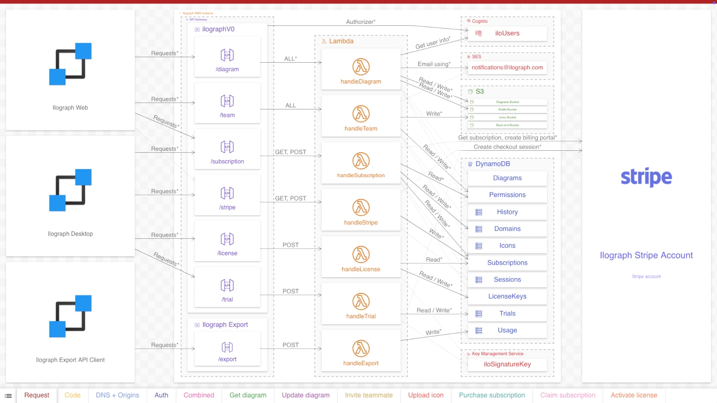
Choosing perspectives requires a thorough understanding of the system, and even then, it is both an art and a science. The first perspective, “Run-time dependency,” shows the resources that serve dynamic data to users. On the left, the three clients use an API Gateway API to store and retrieve data from S3 buckets and DynamoDB tables. A handful of Lambda functions (“lambdas”) run the business logic orchestrating these interactions. A few other AWS services are involved, and the lambdas also interact with Stripe, a third-party payments service.
This perspective is still pretty complicated, but its narrower focus makes the resources and their relations easier to read. The resources themselves are more homogenous, improving the cohesiveness and consistency of their relations. This cohesion makes it far easier to discern, for example, that this is a 3-tier serverless architecture, serving three clients and with an external dependency on Stripe.
Perspective 2: Deploy-time dependency
Purpose: Show the code dependencies for the lambda functions
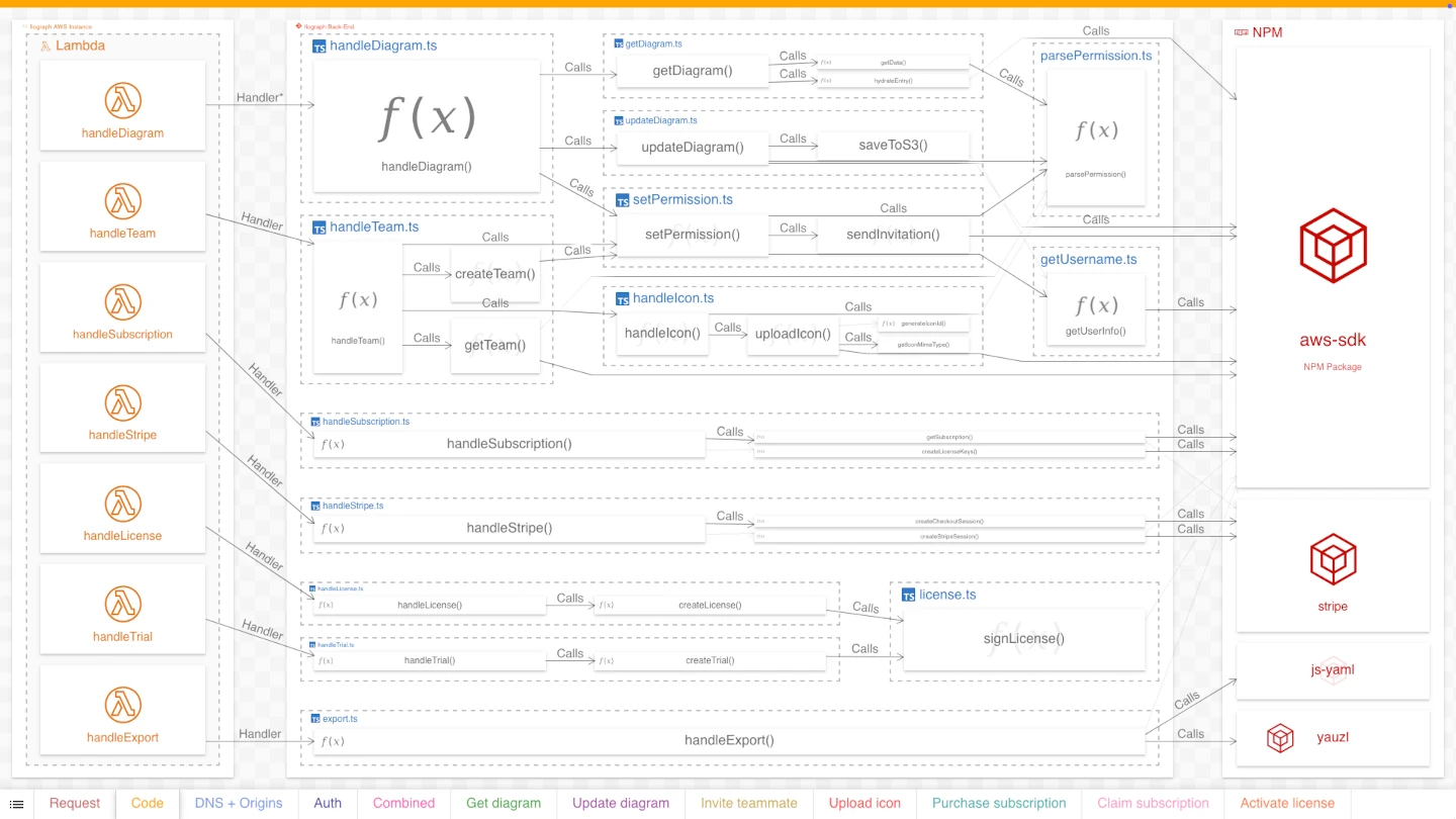
The lambdas in this system (like all lambdas) require code to execute. This code is the business logic that queries databases, sends emails, interfaces with Stripe, and everything else that happens when a client interfaces with the API.
This code, written in Typescript, is stored in a git repository called “Ilograph Back-End”. Our second perspective, “Deploy-time dependency,” details where this code comes from and how it is organized. It shows which “handler” functions the lambdas invoke and which functions those invoke in turn. Further, many of these functions depend on libraries stored in npm; this perspective also includes these dependencies.
Notice how both this perspective and the previous perspective include the same lambda functions.
Crucially, these dependencies exist only when the system is deployed, not while it is running. Once these lambdas are deployed, they no longer depend on git or npm. Either service could go down, and the lambdas would function fine.
This distinction between run-time and deploy-time dependencies is the key motivation for separating these perspectives. Viewers benefit not only from understanding this distinction but also from the improved cohesion of each perspective individually.
Perspective 3: DNS + Origins
Purpose: Show configured relations between static resources
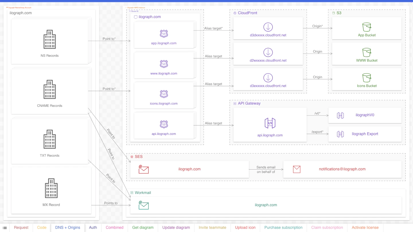
The “Run-time dependency” perspective detailed how the system handles dynamic data and interactions. Our third perspective, “DNS + Origins,” instead shows relations between resources handling “static” data. Static data includes HTML files, javascript files, and other data required by the web app (and the Ilograph website). As detailed in this perspective, these files are not served by the API but by CloudFront distributions backed by S3 buckets.
Additionally, this perspective includes DNS settings configured by Route53/Namecheap and email settings for the ilograph.com domain in SES and workmail.
The app needs properly functioning DNS, Cloudfront, and email configurations, but their static nature makes them prime candidates for a separate perspective.
Perspective 4: Triggers/Bookkeeping
Purpose: Show miscellaneous functionality that happens on user sign-up and sign-in
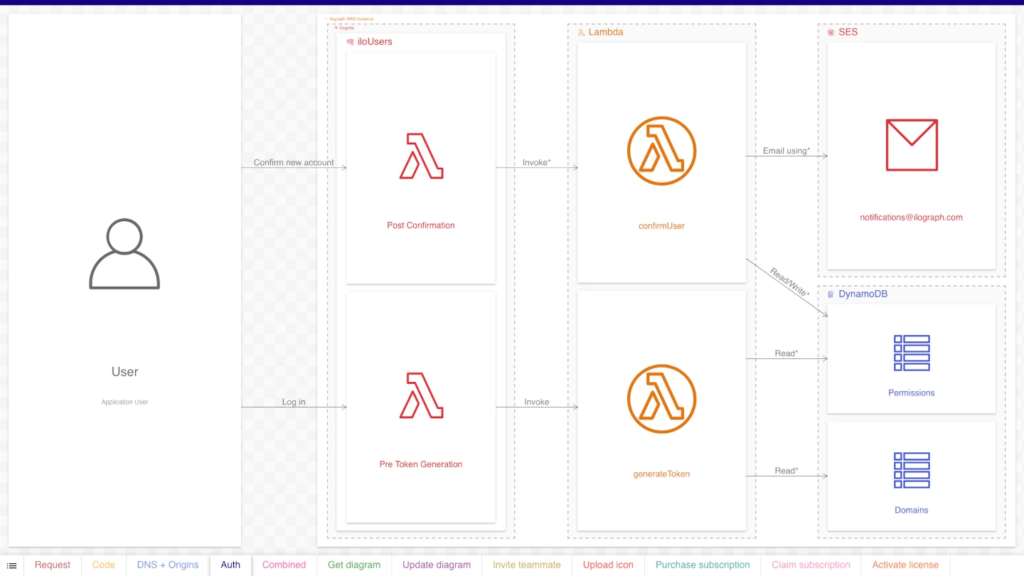
Our final (and most minor) perspective breaks out functionality triggered when a user signs up or signs in. Lambda functions triggered by Cognito handle these events. They send welcome emails (when users sign up) and perform other bookkeeping tasks. This functionality is best detailed separately because it is not part of the API detailed in the “Run-time dependency” perspective.
Master vs. high-level diagrams
An important distinction must be made between master and high-level diagrams:
Master diagrams attempt to show all facets of the system at once.
High-level diagrams show resources and relations at a reduced level of detail.
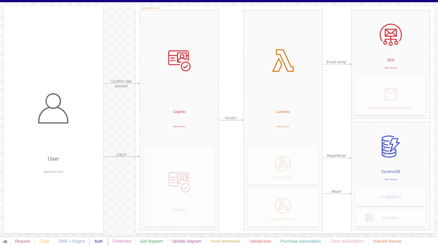
For example, if we lower the detail in our first perspective, we get a high-level diagram of the run-time dependencies. Instead of showing relations between individual lambdas, database tables, and so on, the diagram shows relations between their AWS services:

We can also reduce the level of detail to get a high-level diagram of the “Triggers” perspective:
Master diagrams can also be high-level. Here is the original diagram at a reduced level of detail:
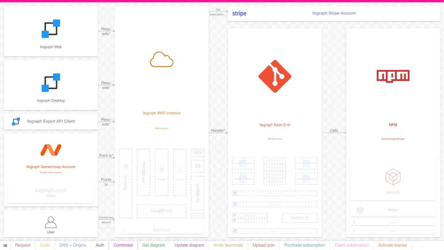
While easier to read than the original, it still has the drawbacks of mixing run-time/deploy-time and static/dynamic concerns.
(Not) seeing it all
The benefits of breaking up a “master” diagram into smaller diagrams are hopefully clear. Smaller diagrams are less intimidating and more accessible. They also allow for more detail, such as resource names and arrow labels. Separating concerns (dynamic vs. static, run-time vs. design-time) further aids understanding.
Just as significantly, breaking down large diagrams improves the mindset of the diagram viewer. It implicitly reassures them that it is OK not to understand everything simultaneously. They are not expected to “see” the entire system as if it contained some profound truth or deeper meaning. System architecture diagrams are a tool for understanding; like with most things, simplicity is key.
Click here to view the diagram used throughout this article.
Questions or comments? Please reach out to me on LinkedIn or by email at billy@ilograph.com.